Next to the traditional X11 front-end, XBoard is now also supplied with a GTK+ front-end. This is still in an alpha stage, but approaching perfection quickly. To build the GTK version, use the command "./configure --with-gtk". After this "make" will cause the GTK version to be built. The sources of the version thatcan be built this way can be found in the "gtk2" branch of the on-line repository on this website.
This page presents an overview of the imperfections that still linger in the GTK+ front-end for XBoard. Note that XBoard generates all its windows through a generic dialog creator routine, which is driven by a table of 'Option' descriptions, supplied by either the currently loaded engine, or predefined in the back-end (and shared with other front-ends, such as the old X11 code, and WinBoard). Problems must be solved in a general way in this dialog creator code.
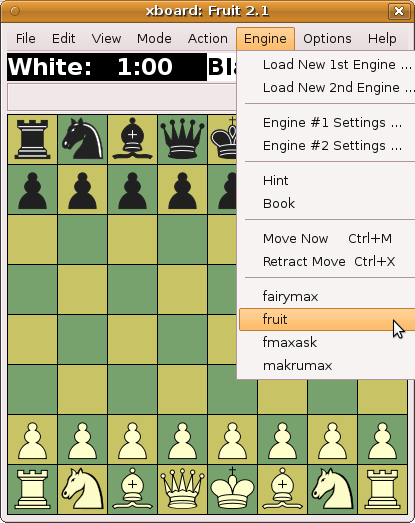
The recent engines are correctly added to the Engine menu.
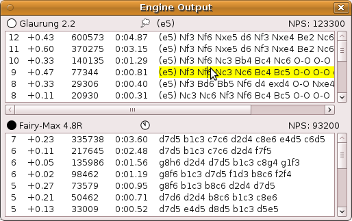
Engine output - Weird space before color logo in header of first pane.
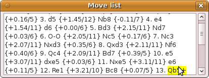
Move list - Automatically scrolls to keep the current move (highlighted in yellow) in view, but if the score comment behind it wraps to the next line, it is not visible.
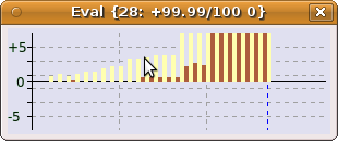
Evaluation graph - Looks fine.
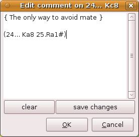
Edit Comment - The OK and Cancel should really go onto the same row as the other buttons.
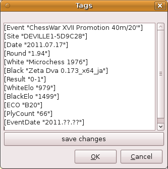
Edit Tags - The OK and Cancel should really go onto the same row as the other button.
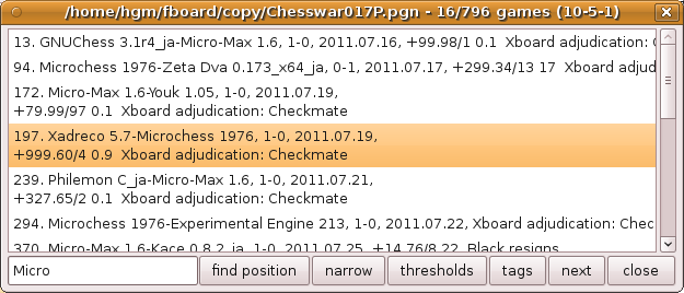
Game list - Seems fine. (But perhaps no wrapping of long lines?)
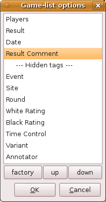
Game-list tags - Looks fine. (X11 version has buttons on same row, but that would not improve matters here.)
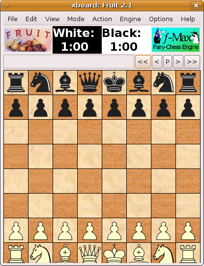
Logo display - The height is miscalculated. The logos are in an aspect frame, but it does not size with the main window.
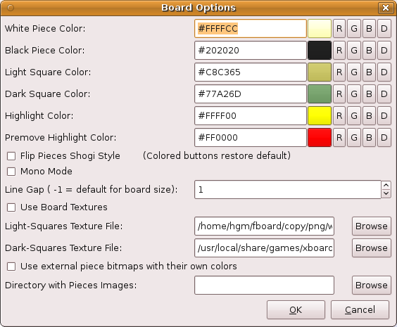
Board Options - The color selectors, no matter how inventively designed (if I may say so) should really be replaced by a native color picker. Currently they don't automatically react to typed changes in the hex color codes.
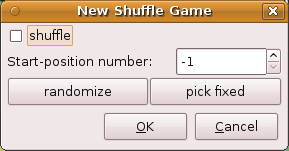
New Shuffle - Would be better if OK & Cancel displayed on same row as other buttons. (But small enough that it doesn't hurt.)
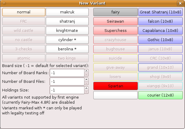
New Variant - A mysterious unnecessary empty space appears at the bottom. (The main board window also suffers from this, but there code is added to squeeze out 25 pixels by vertical resizing.)
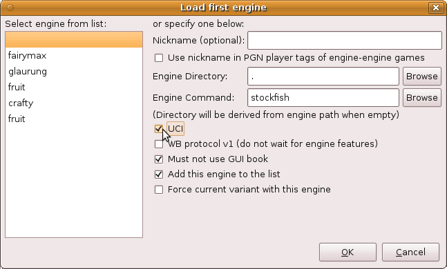
Load Engine - The OK & Cancel button should be absorbed in the second panel.
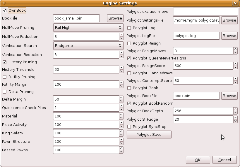
Engine Settings - Also here OK and Cancel waste space, and in engines with many options this really hurts.
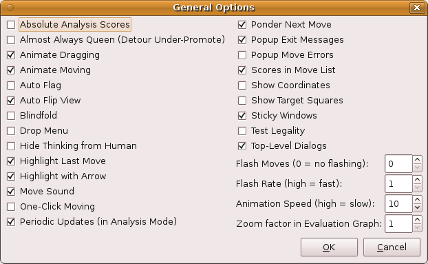
General Options - Looks fine, although OK and Cancel could be absorbed in second panel by moving the 'Break' one Option down.
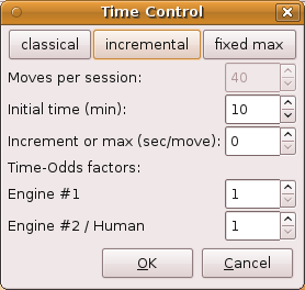
Time Control - Looks fine.
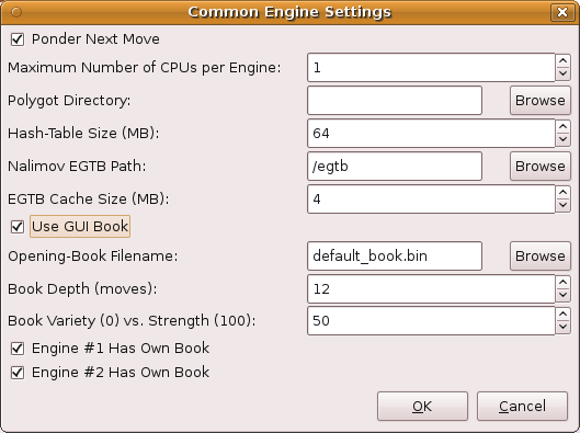
Common Engine Settings - Looks fine.
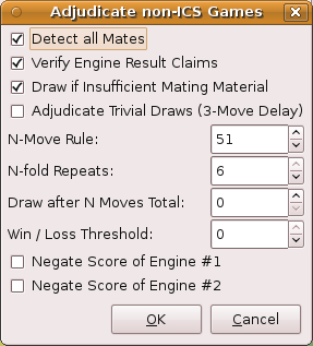
Adjudication Options - Looks fine.
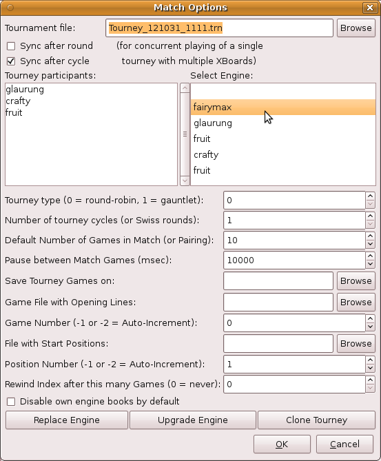
Match - Too tall, and the OK & Cancel waste space on top of that. It is also pretty wide, though, because the labels in front of the options are rather long. So side-by-side panels do not seem an option, although moving the participants textview and engine-selection listbox in a separate panel would probably cause them to narrow substantially. Introducing a version of the Break Option that causes a tabbed window (notebook widget) could help. (The file stuff could go to a second panel.)
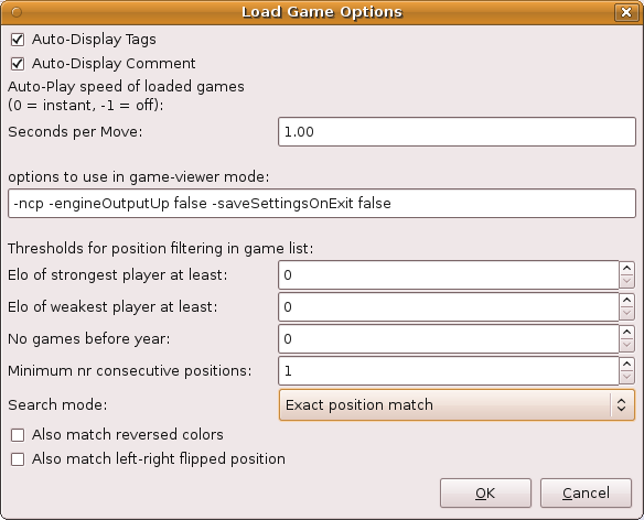
Load Game - Looks fine.
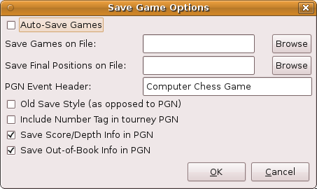
Save Game - Looks fine.
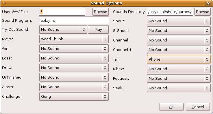
Sound - Looks fine.
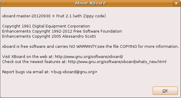
Links are not only un-clickable, but even uncopyable.
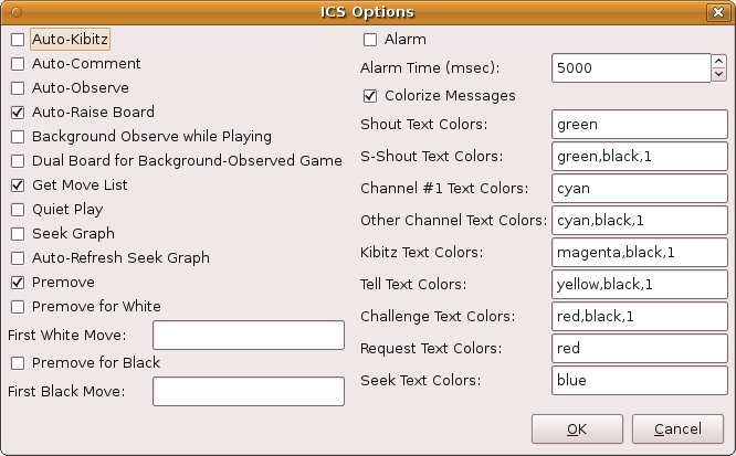
ICS Options - Looks fine.

ICS Input Box - Pops up a bit narrow, but OK after sizing. Unsollicited empty space at bottom.
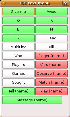
ICS Text Menu - Last (odd) button is displayed too wide. Unsollicited empty space at bottom.
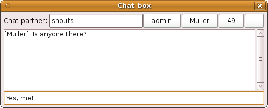
Chat Box - Looks OK. But would look better with a tabbed window (for the various chat partners) anyway.

Error popup - Looks OK.
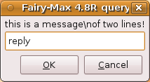
Engine query - Looks OK.

Promotion dialog - Buttons unnecessary tall.